++ Click Image to Enlarge ++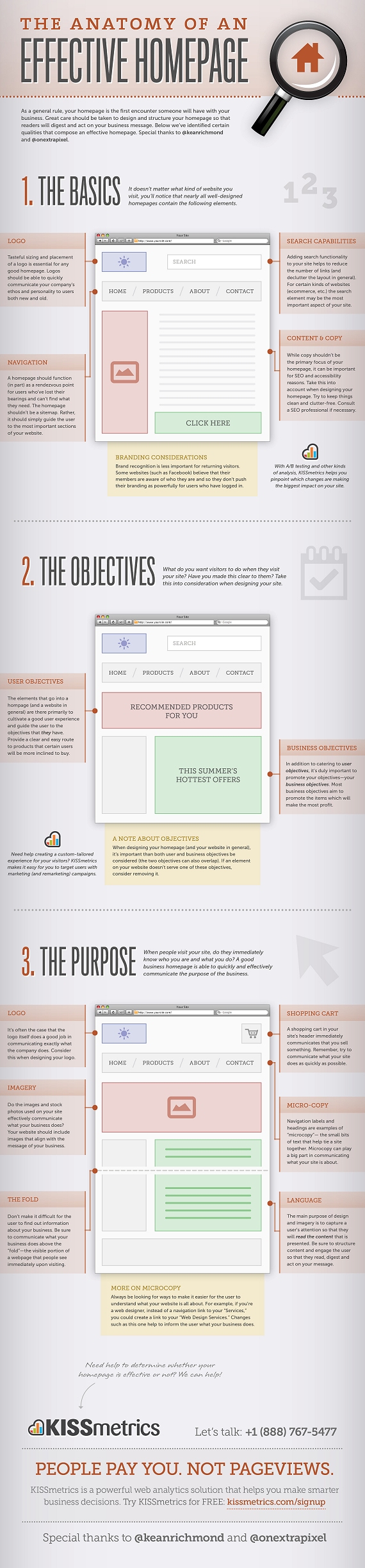
Source: The Anatomy of an Effective Homepage Infographic
[youtube http://www.youtube.com/watch?v=P7GY1fE5JQQ]
++ Click Image to Enlarge ++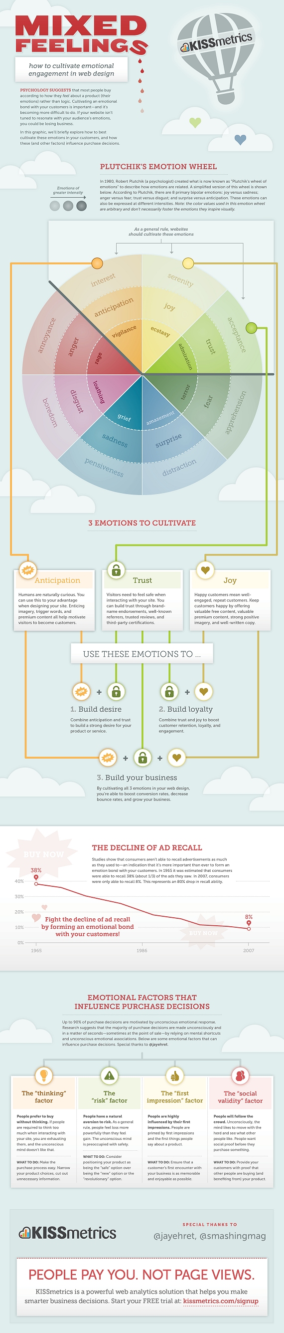
Source: Mixed Feelings – How To Cultivate Emotional Engagement In Web Design
++ Click Image to Enlarge ++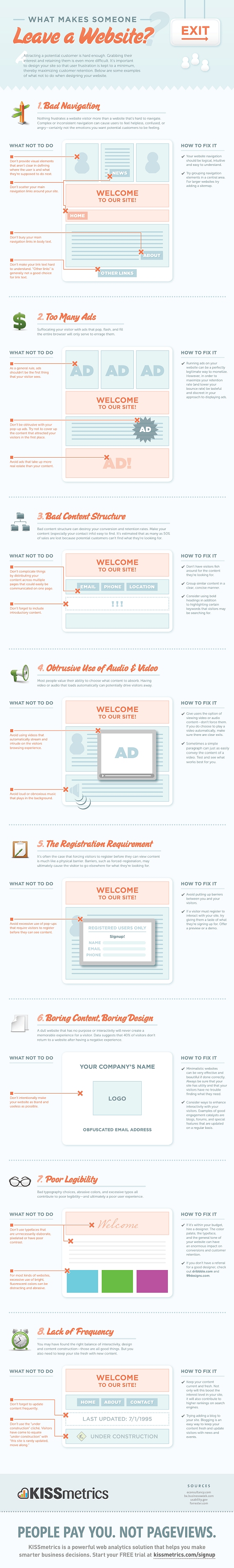
Source: What Makes Someone Leave A Website?
Far be it from me to criticize the French. But yesterday France launched France.fr with a middling amount of press attention. But the site went down almost immediately after launching. This morning we gave it a pass, but tonight it’s still down. And we’re not sure anyone is working very hard to get it back up – it is just an information website, after all.
From The Connexion on the launch:
A NEW official website providing information about France in English has been launched by the French government.
France.fr went live this morning to coincide with the fête nationale and is available in French, English, German, Italian and Spanish.
The site aims to promote the country to tourists but also to provide residents with practical information about all elements of life in France – including studying, working, setting up a business and day-to-day living.
The prime minister’s office, which is managing the new online project, said the site would grow in the coming months and it will contain some 12,000 links to other online resources including Météo France and tourist offices.
And France’s senior government official overseeing the Internet, Nathalie Kosciusko-Morizet, even took the time to tweet “Lancement aujourd’hui du portail officiel de la France dans le monde” (“Today’s launch of official website of France in the world”).
A French friend says of the site (when it was live) “It just does not work, full of bugs, and the english translation is hilariously bad.” He won’t let me attribute his quote though, saying he’d like to remain in good standing with the French community.
For now France.fr has a landing page saying the site is unavailable in a variety of languages. In French it goes into more detail, noting that the site is a victim of its own success.
There’s the joke about how the only people France can beat at anything are the French themselves, usually noting the French Revolution. But I won’t repeat that here. Instead I’ll just say –
Vive la France!
The BBC has unveiled its new look news website this morning, with a cleaner design and more social media integration the most obvious changes.
The site has only been live for a few hours, but has already attracted a fair amount of criticism from users. I’ve been taking a look at the new site…
This is the old BBC news page:
And the new version:
The new page has more white space and a little less clutter than the old version, partly thanks to the fact that the left hand navigational options have gone, replaced by a menu bar at the top of the page. I’m not sure about the new font though.
The video and live TV content is displayed more prominently on the right hand side of the page, the video is now shown in a larger size, while the site’s video content has been gathered together in one page.
The article pages have had the same treatment, with more white space behind the stories:
Old article page:
Instead of showing related links at the right hand side of the page, the top stories on the site and a box showing current features have been given more prominence. More links have been provided to allow readers to share articles on just about every social network, with Facebook and Twitter the most prominent.
Links to related articles and outbound links to other news sites are now shown at the foot of the page. This perhaps makes sense, since people will finish the article and want to read more, b
The new site seems to have divided opinion so far, which is natural for a redesign of such a popular website. Several commentors have picked up on the likeness to the CNN website, and the article pages on CNN are certainly similar.
There are 250+ comments on the BBC Editors’ Blog, and the majority of them are negative, though opinions via the Twitter hashtag #bbcnewssite are more positive towards the redesign. Stephen Fry likes it anyway…
Martin Belam has a good round up of the feedback on the new BBC site.
The Business Link website costs £2.15 per visitor, it has been revealed, as the government announces plans to close up to 75% of publicly funded sites in an effort to save millions of pounds.
According to a report by the Central Office of Information, the running of 46 government websites cost £94m plus £32m in staffing costs in 2009/10.
The most expensive was BusinessLink.gov.uk, which provides advice to small companies, at a cost of £35.78m. That equates to £2.15 per visit. The UK Trade and Invest website cost much less at £4.7m but attracted only 399,501 users representing £11.78 per visit.
Following the findings, ministers said they intend to axe up to three quarters of the total 820 government-funded sites and force those that remain to reduce costs by 50%.
Shocking!


