++ Click Image to Enlarge ++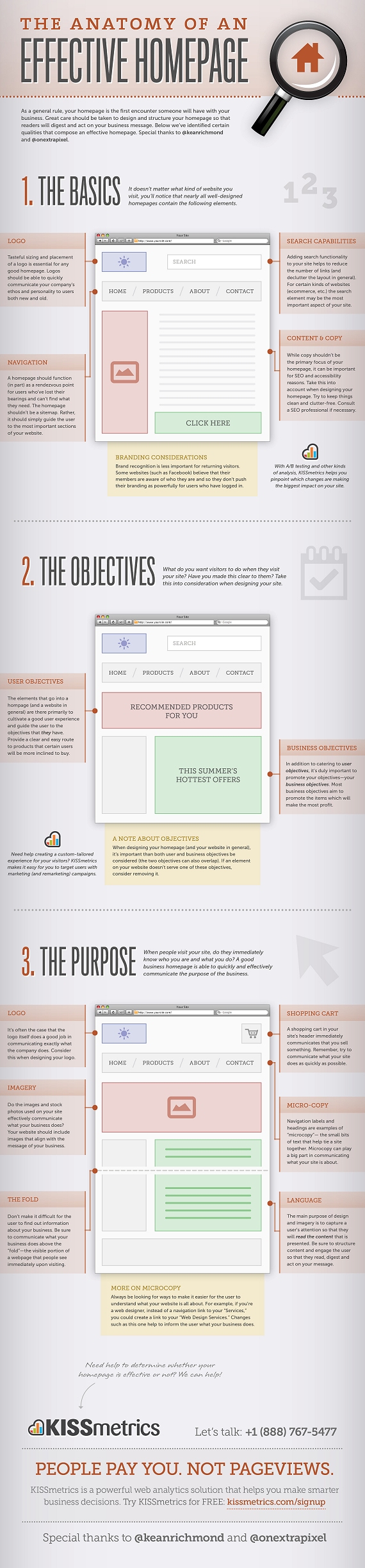
Source: The Anatomy of an Effective Homepage Infographic
++ Click Image to Enlarge ++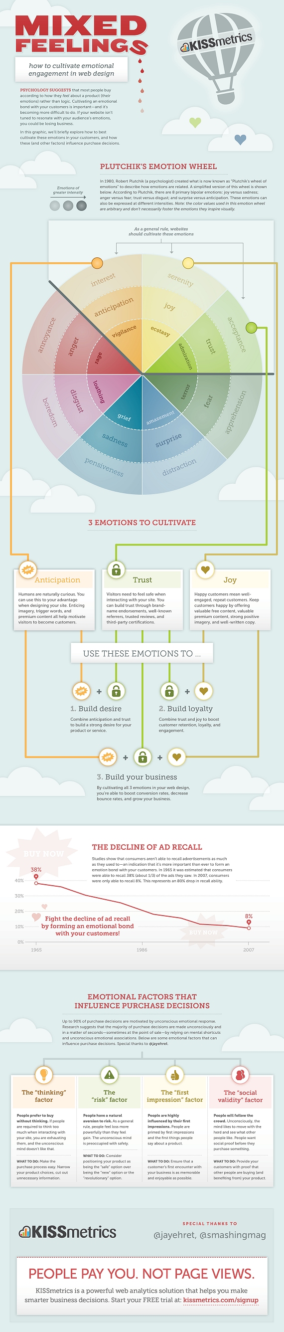
Source: Mixed Feelings – How To Cultivate Emotional Engagement In Web Design
++ Click Image to Enlarge ++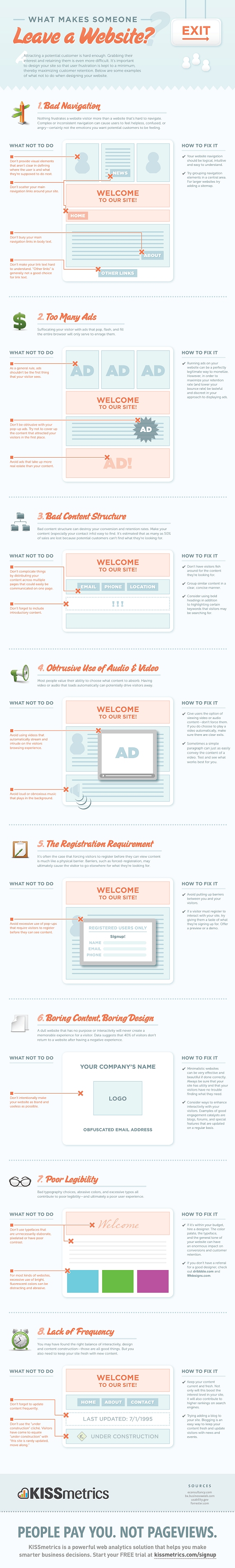
Source: What Makes Someone Leave A Website?
The importance of having an attractive website that converts visitors into buyers and helps cleverly promote your small business is essential in these fiercely competitive times.
Your website has to capture a visitor’s attention, entice him or her to stay and browse around, create an interest in your product or service, and result in sales. For small businesses with limited time and budgets, design is an essential factor in both attracting and converting potential customers.
With this in mind, here are five current design trends that most small businesses can utilize to great effect.
1. Minimalism
While this web design style has been popular for some time, it’s worth revisiting as no small business owner wants to turn visitors away with a cluttered, overbearing and hard to navigate website.
Minimalist design effectively strips away the excess and helps the user concentrate squarely on the content. If a page has too many elements, the user will easily become confused about where to focus on, with many elements vying for attention.
With page weight now affecting your Google search engine position, it’s the perfect time to reassess how streamlined your design is.
There are several principles and steps you can follow to create a more minimalist design:
1. Go through your site and prune any unnecessary widgets or elements which aren’t serving a real purpose.
2. Make good use of whitespace, which is the space between different elements of a design. Used well, it will allow for easier scanning of your site and help frame the elements on each page.
3. With fewer elements, choosing the right color palette or accent color is critical. As color has great significance and meaning, it’s best to test how certain colors interact with each other.
4. Browse your site through the eyes of your visitors, evaluating if there is too much information, confusing or off-putting elements, or sufficient calls to action. Answering these types of questions truthfully will help you prioritize the essential elements.
A minimalist design doesn’t have to be bland and boring; it can easily be modern, fresh, sophisticated, elegant or refined, based solely on the details within the design.
2. Unique Photography
Two men shaking hands, a group of people in suits sharing a joke, the call center girl: these are all tired, clichéd images that litter thousands of business websites. These types of images fail to convey either information on the company or a sense of the site’s character, and are essentially meaningless.
Using custom photography or artwork whenever possible is recommended, though for small business owners, both time and budget are limited and stock photos are a relatively cheap and accessible resource.
So when choosing stock imagery, it’s best to keep in mind these four tips:
1. Research your competitors and industry and take note of the images used. You can then find a unique way to represent your product or service.
2. Avoid being too literal in your choice of imagery as abstract compositions often give a more dramatic and memorable effect.
3. Don’t always opt for the cheaper low-res image, as pixelated imagery devalues your overall design and looks unprofessional.
4. Veer away from the bland and predictable and let the images ‘break out of the box’.
Imaginative imagery will reinforce your brand message and add greater character to your website. So, when you must use stock imagery, do so with great care and take the time to find the right piece that will convey the true personality of your service or product.
3. Bold Typography
Web design at its core is about communication, and typography is a vital component of that. Great web typography helps bring order to information and creates a coherent, visually satisfying experience that engages the reader without their knowing.
A recent trend is the use of big, bold typography which helps to create contrast between other text while grabbing a user’s attention. Oversized text can help create hierarchy and ensure users understand your message loud and clear.
In order to utilize typography to create a bold statement, keep in mind the following tips:
1. Determine the single most important message you want to emphasize, as too many messages can lead to choice paralysis. Understand the qualities of the message you are trying to convey, and then look for typefaces that embody those qualities.
2. Choose a typeface that will match the character of your work. For instance, if your company embodies the feel of an Old Style font, you should consider Bembo, Garamond and Sabon. It will also greatly depend on what you want to convey with the type, because legibility is as important as the character of the type.
3. Give the typography the prominent position it deserves by surrounding it with a generous amount of whitespace. This will add emphasis and create even more focus on the typography.
4. Test out some of the various font replacement options such as Typekit or Typotheque. These allow you to license fonts to embed within your site, and help you to experiment with beautiful typography.
Typography is an art and the decisions you make are subjective; however, carefully selecting a typeface can make a huge difference to the quality of your design.
4. Clear Calls to Action
As a small business owner you want your visitors to complete a certain task when they land on your page. It could be to download, sign up or checkout, but these calls to action are one of the most important (and overlooked) elements in a small business website.
You want to grab your visitor’s attention and move him or her to take action. Crafting a clear, concise call to action is essential.
Here are four tips to keep in mind when designing a call-to-action button or advertisement:
1. Language: Keep the wording short and snappy (always start with a verb), but also explain the value behind the action the user is taking. In some instances it also helps to create a sense of urgency using words such as ‘now’, ‘hurry’ and ‘offer ends,’ with ‘free’ being the number one incentive.
2. Positioning: Ideally, calls to action should be above the fold, and be placed on every page of the site in a consistent position. For instance, Squarespace (shown above), not only has a large call-to-action button at the top of the page, but also has a slightly smaller button in the footer of every page.
3. Color: The color should make the call stand out from the rest of the design. Brighter, more contrasting colors usually work best for smaller buttons. For larger buttons, you may want to choose a less prominent color (but one that still stands out from your background), so as to balance out its size.
4. Size: The call-to-action button should be the largest button on any given page. You want it to be large enough to stand out without overwhelming the rest of the design
It’s vital you test different combinations of call-to-action buttons and see how each affects your conversion rates (see A/B Testing below). It’s also best to make sure they fit within your overall design.
5. A/B Testing
With competition growing fiercer online, it’s important for small businesses to have a website that converts visitors to buyers and creates a competitive edge. That’s why it is important to continually measure and improve site performance, usability and conversions.
One of the foremost ways of optimizing your web design is via A/B testing (sometimes referred to as split testing). An A/B test examines the effectiveness of one landing page over another. The two versions are randomly shown to site visitors to see which generates the best results. You then evaluate the performance of each and use the best version.
Various elements can be tested, including, layouts, copy, graphics, fonts, headlines, offers, icons, colors and more. Here are a few tips for A/B testing:
1. Clearly define your goal before beginning any test. For example, if you wanted to increase sign-ups, you might want to test the following: type of fields in the form, length of the form, and display of privacy policy.
2. Start with elements that will have the biggest impact for minimum effort. For instance, you could tweak the copy on your checkout button to see if conversions can be improved.
3. Don’t use A/B testing in isolation as this alone won’t give you a well-rounded picture of your users. Instead, use other feedback tools, such as Feedback Army or User Testing, in conjunction with A/B testing to get in-depth analysis of user behavior.
A/B testing won’t make a bad design great, but it will prove an effective aid in optimizing your current design’s usability and conversions until you decide to overhaul your website design completely.
These are just five web design trends that small businesses can take part in to enhance their websites. Which web design changes would make the most sense for your small business? Let us know in the comments below about any additional design trends that you have spotted in the small business world
Far be it from me to criticize the French. But yesterday France launched France.fr with a middling amount of press attention. But the site went down almost immediately after launching. This morning we gave it a pass, but tonight it’s still down. And we’re not sure anyone is working very hard to get it back up – it is just an information website, after all.
From The Connexion on the launch:
A NEW official website providing information about France in English has been launched by the French government.
France.fr went live this morning to coincide with the fête nationale and is available in French, English, German, Italian and Spanish.
The site aims to promote the country to tourists but also to provide residents with practical information about all elements of life in France – including studying, working, setting up a business and day-to-day living.
The prime minister’s office, which is managing the new online project, said the site would grow in the coming months and it will contain some 12,000 links to other online resources including Météo France and tourist offices.
And France’s senior government official overseeing the Internet, Nathalie Kosciusko-Morizet, even took the time to tweet “Lancement aujourd’hui du portail officiel de la France dans le monde” (“Today’s launch of official website of France in the world”).
A French friend says of the site (when it was live) “It just does not work, full of bugs, and the english translation is hilariously bad.” He won’t let me attribute his quote though, saying he’d like to remain in good standing with the French community.
For now France.fr has a landing page saying the site is unavailable in a variety of languages. In French it goes into more detail, noting that the site is a victim of its own success.
There’s the joke about how the only people France can beat at anything are the French themselves, usually noting the French Revolution. But I won’t repeat that here. Instead I’ll just say –
Vive la France!
The BBC has unveiled its new look news website this morning, with a cleaner design and more social media integration the most obvious changes.
The site has only been live for a few hours, but has already attracted a fair amount of criticism from users. I’ve been taking a look at the new site…
This is the old BBC news page:
And the new version:
The new page has more white space and a little less clutter than the old version, partly thanks to the fact that the left hand navigational options have gone, replaced by a menu bar at the top of the page. I’m not sure about the new font though.
The video and live TV content is displayed more prominently on the right hand side of the page, the video is now shown in a larger size, while the site’s video content has been gathered together in one page.
The article pages have had the same treatment, with more white space behind the stories:
Old article page:
Instead of showing related links at the right hand side of the page, the top stories on the site and a box showing current features have been given more prominence. More links have been provided to allow readers to share articles on just about every social network, with Facebook and Twitter the most prominent.
Links to related articles and outbound links to other news sites are now shown at the foot of the page. This perhaps makes sense, since people will finish the article and want to read more, b
The new site seems to have divided opinion so far, which is natural for a redesign of such a popular website. Several commentors have picked up on the likeness to the CNN website, and the article pages on CNN are certainly similar.
There are 250+ comments on the BBC Editors’ Blog, and the majority of them are negative, though opinions via the Twitter hashtag #bbcnewssite are more positive towards the redesign. Stephen Fry likes it anyway…
Martin Belam has a good round up of the feedback on the new BBC site.
The Business Link website costs £2.15 per visitor, it has been revealed, as the government announces plans to close up to 75% of publicly funded sites in an effort to save millions of pounds.
According to a report by the Central Office of Information, the running of 46 government websites cost £94m plus £32m in staffing costs in 2009/10.
The most expensive was BusinessLink.gov.uk, which provides advice to small companies, at a cost of £35.78m. That equates to £2.15 per visit. The UK Trade and Invest website cost much less at £4.7m but attracted only 399,501 users representing £11.78 per visit.
Following the findings, ministers said they intend to axe up to three quarters of the total 820 government-funded sites and force those that remain to reduce costs by 50%.
Shocking!


