Author Archives: batterseai
5 Small Business Web Design Trends to Watch
The importance of having an attractive website that converts visitors into buyers and helps cleverly promote your small business is essential in these fiercely competitive times.
Your website has to capture a visitor’s attention, entice him or her to stay and browse around, create an interest in your product or service, and result in sales. For small businesses with limited time and budgets, design is an essential factor in both attracting and converting potential customers.
With this in mind, here are five current design trends that most small businesses can utilize to great effect.
1. Minimalism
While this web design style has been popular for some time, it’s worth revisiting as no small business owner wants to turn visitors away with a cluttered, overbearing and hard to navigate website.
Minimalist design effectively strips away the excess and helps the user concentrate squarely on the content. If a page has too many elements, the user will easily become confused about where to focus on, with many elements vying for attention.
With page weight now affecting your Google search engine position, it’s the perfect time to reassess how streamlined your design is.
There are several principles and steps you can follow to create a more minimalist design:
1. Go through your site and prune any unnecessary widgets or elements which aren’t serving a real purpose.
2. Make good use of whitespace, which is the space between different elements of a design. Used well, it will allow for easier scanning of your site and help frame the elements on each page.
3. With fewer elements, choosing the right color palette or accent color is critical. As color has great significance and meaning, it’s best to test how certain colors interact with each other.
4. Browse your site through the eyes of your visitors, evaluating if there is too much information, confusing or off-putting elements, or sufficient calls to action. Answering these types of questions truthfully will help you prioritize the essential elements.
A minimalist design doesn’t have to be bland and boring; it can easily be modern, fresh, sophisticated, elegant or refined, based solely on the details within the design.
2. Unique Photography
Two men shaking hands, a group of people in suits sharing a joke, the call center girl: these are all tired, clichéd images that litter thousands of business websites. These types of images fail to convey either information on the company or a sense of the site’s character, and are essentially meaningless.
Using custom photography or artwork whenever possible is recommended, though for small business owners, both time and budget are limited and stock photos are a relatively cheap and accessible resource.
So when choosing stock imagery, it’s best to keep in mind these four tips:
1. Research your competitors and industry and take note of the images used. You can then find a unique way to represent your product or service.
2. Avoid being too literal in your choice of imagery as abstract compositions often give a more dramatic and memorable effect.
3. Don’t always opt for the cheaper low-res image, as pixelated imagery devalues your overall design and looks unprofessional.
4. Veer away from the bland and predictable and let the images ‘break out of the box’.
Imaginative imagery will reinforce your brand message and add greater character to your website. So, when you must use stock imagery, do so with great care and take the time to find the right piece that will convey the true personality of your service or product.
3. Bold Typography
Web design at its core is about communication, and typography is a vital component of that. Great web typography helps bring order to information and creates a coherent, visually satisfying experience that engages the reader without their knowing.
A recent trend is the use of big, bold typography which helps to create contrast between other text while grabbing a user’s attention. Oversized text can help create hierarchy and ensure users understand your message loud and clear.
In order to utilize typography to create a bold statement, keep in mind the following tips:
1. Determine the single most important message you want to emphasize, as too many messages can lead to choice paralysis. Understand the qualities of the message you are trying to convey, and then look for typefaces that embody those qualities.
2. Choose a typeface that will match the character of your work. For instance, if your company embodies the feel of an Old Style font, you should consider Bembo, Garamond and Sabon. It will also greatly depend on what you want to convey with the type, because legibility is as important as the character of the type.
3. Give the typography the prominent position it deserves by surrounding it with a generous amount of whitespace. This will add emphasis and create even more focus on the typography.
4. Test out some of the various font replacement options such as Typekit or Typotheque. These allow you to license fonts to embed within your site, and help you to experiment with beautiful typography.
Typography is an art and the decisions you make are subjective; however, carefully selecting a typeface can make a huge difference to the quality of your design.
4. Clear Calls to Action
As a small business owner you want your visitors to complete a certain task when they land on your page. It could be to download, sign up or checkout, but these calls to action are one of the most important (and overlooked) elements in a small business website.
You want to grab your visitor’s attention and move him or her to take action. Crafting a clear, concise call to action is essential.
Here are four tips to keep in mind when designing a call-to-action button or advertisement:
1. Language: Keep the wording short and snappy (always start with a verb), but also explain the value behind the action the user is taking. In some instances it also helps to create a sense of urgency using words such as ‘now’, ‘hurry’ and ‘offer ends,’ with ‘free’ being the number one incentive.
2. Positioning: Ideally, calls to action should be above the fold, and be placed on every page of the site in a consistent position. For instance, Squarespace (shown above), not only has a large call-to-action button at the top of the page, but also has a slightly smaller button in the footer of every page.
3. Color: The color should make the call stand out from the rest of the design. Brighter, more contrasting colors usually work best for smaller buttons. For larger buttons, you may want to choose a less prominent color (but one that still stands out from your background), so as to balance out its size.
4. Size: The call-to-action button should be the largest button on any given page. You want it to be large enough to stand out without overwhelming the rest of the design
It’s vital you test different combinations of call-to-action buttons and see how each affects your conversion rates (see A/B Testing below). It’s also best to make sure they fit within your overall design.
5. A/B Testing
With competition growing fiercer online, it’s important for small businesses to have a website that converts visitors to buyers and creates a competitive edge. That’s why it is important to continually measure and improve site performance, usability and conversions.
One of the foremost ways of optimizing your web design is via A/B testing (sometimes referred to as split testing). An A/B test examines the effectiveness of one landing page over another. The two versions are randomly shown to site visitors to see which generates the best results. You then evaluate the performance of each and use the best version.
Various elements can be tested, including, layouts, copy, graphics, fonts, headlines, offers, icons, colors and more. Here are a few tips for A/B testing:
1. Clearly define your goal before beginning any test. For example, if you wanted to increase sign-ups, you might want to test the following: type of fields in the form, length of the form, and display of privacy policy.
2. Start with elements that will have the biggest impact for minimum effort. For instance, you could tweak the copy on your checkout button to see if conversions can be improved.
3. Don’t use A/B testing in isolation as this alone won’t give you a well-rounded picture of your users. Instead, use other feedback tools, such as Feedback Army or User Testing, in conjunction with A/B testing to get in-depth analysis of user behavior.
A/B testing won’t make a bad design great, but it will prove an effective aid in optimizing your current design’s usability and conversions until you decide to overhaul your website design completely.
These are just five web design trends that small businesses can take part in to enhance their websites. Which web design changes would make the most sense for your small business? Let us know in the comments below about any additional design trends that you have spotted in the small business world


via openforum.com
Facebook Encourages Ecommerce; App-Makers Respond | Practical eCommerce
Facebook designates Fan pages for businesses to engage users. And to help these businesses, Facebook now provides a series of resource guides for Fan page development and Facebook Ads development. It has also greatly improved the Fan page analytics component (called Insights), and it has created a series of plugins for businesses to use on their own websites.
Milyoni (pronounced “million eye”), based in Calif., takes this integration of social media and ecommerce very seriously. It has built an all-inclusive, six-part Facebook platform called Conversational Commerce. The platform allows consumers to complete a purchase without leaving Facebook. And for ecommerce merchants, the platform merchandises their products, markets them to Facebook users, completes sale transactions and otherwise manages the entire process in a manner similar to a freestanding ecommerce site. It’s all done within Conversational Commerce’s six components: iFanStore, Social Engagement, Flexible Fulfillment, Opportunity Mapping, Merchant Dashboard, and Instant Showcase.

Conversational Commerce by Milyoni.
iFanStore
iFanStore is the core component of a larger, six-part platform from Milyoni called Conversational Commerce. Rather than pass users off to another website, it is a shopping cart that operates completely within Facebook. Transactions are processed through PayPal, Authorize.Net, or most any other payment gateway, according to the company.
Aside from the fact it resides inside a Facebook fan page, iFanStore functions just like any other shopping cart. It manages catalog uploads, offers detailed product management, order management, shipping and tax calculations, payment processing and reporting. It also supports digital downloads such as music or video.
Social Engagement
The company clearly understands how social media and ecommerce should be intertwined. “It is not about shopping. People don’t go to Facebook to shop. A conversation begins by engaging your fan base and offering up opportunities to purchase contextually relevant items,” said Dean Alms, Milyoni’s vice president of strategy and marketing. “When your favorite NBA basketball team advances in the finals; it’s great to share your jubilation online with other fans and it might be the right time to buy a new hat or t-shirt to celebrate the win.”
That is where Milyoni’s Social Engagement component comes into play. It allows merchants to engage their Fan base and promote products via Wall posts, which fans can then comment on, Like and share.
Here are two examples of ways these posts appear.

Example 1 of Milyoni’s Social Engagement wall post.

Example 2 of Milyoni’s Social Engagement wall post.
Flexible Fulfillment
Another Milyoni component, Flexible Fulfillment, is a defined set of interfaces that allow merchants to integrate the iFanStore with their existing backend systems. This ranges from the ability for merchants to manually upload their catalogs and receive email notifications for orders, to complete integration via custom APIs.
Opportunity Mapping
Available in the fourth quarter of 2010, Milyoni’s Opportunity Mapping™ will be a social network application that leverages the power of Facebook’s Open Graph to tap into fan profile data and create relevant, custom offers.
Merchant Dashboard
Merchant Dashboard is Milyoni’s administrative console that provides a comprehensive set of analytics to help merchants acquire Fans, promote products and monitor engagement levels.

Screen capture of Milyoni’s iFanStore Manager.
Instant Showcase
Another soon to-be-released component, called Instant Showcase, adds a new twist to the Facebook commerce buying experience in that it will allow users to purchase select products directly from the fan page Wall. Merchants will be able to select up to five products from their store catalog and post them to their Walls. Users can flip through the products, select one and submit payment without ever leaving their wall. Milyoni expects to deploy Instant Showcase in September 2010.
Cost
At about $1,000 per year, Milyoni’s platform is affordable for smaller online retailers, and the company has a number of such merchants in its portfolio. The price includes activation, monthly hosting and transaction fees. It will also help with setup and training for new merchant customers.
Better to Upload an Entire Catalog or Just Special Offers?
Not everyone agrees that uploading an entire catalog into Facebook is the wisest course of action. Alex Bernstein, managing partner with NorthSocial, a west-coast company that makes Facebook Fan page apps, is one such person. “Social media presents a great opportunity to sell products, but, as any merchant knows, there is a lot that goes into getting someone to make a purchase,” he says. “Simply moving an ecommerce cart into Facebook is not enough to spike sales.”
Bernstein suggests that making the product shareable is a key factor, as well as is having an entertaining, heart-warming, and engaging fan page where the brand interacts with fans. He also says that not all products are as well suited to a social network environment as others. “Big ticket items like cars, for example, or commodity products. Those don’t fare as well,” he adds.
Bernstein encourages merchants to think about using Facebook as a place to highlight certain products and showcase new ones. That is exactly how one smaller merchant utilizes the Milyoni platform. Cowgirl Creamery, an organic cheese business located north of San Francisco, offers weekly cheese deals to its customers via its iFanStore rather than using it to upload the entire product catalog. They post the offer to the Wall along with a question or comment to get the conversation started.

Cowgirl Creamery’s Facebook store.
“Word of Mouth endorsements have always been our most effective marketing tool. Milyoni brought this advantage to Facebook to open new markets and sell our premium cheeses to new customers,” said Sue Conley, CEO of Cowgirl Creamery.
“Since the Conversational Commerce platform was deployed, Cowgirl Creamery has nearly doubled their fan base and increased their word of mouth marketing impact accordingly,” says Dean Alms. “In a very short period of time, dozens of new customers have bought through their Facebook store and they are reaching customers that they would have never been able to reach otherwise.”
Summary
Facebook members may not be rushing to interact with businesses. But ecommerce merchants should still have a presence there. The sheer immensity of the network mandates it. And as social commerce continues to mature and gain mainstream acceptance, merchants will benefit from it.
What Americans Do Online: Social Media Dominates Activity | Nielsen
Americans spend nearly a quarter of their time online on social networking sites and blogs, up from 15.8 percent just a year ago (43 percent increase) according to new research released today from The Nielsen Company. The research revealed that Americans spend a third their online time (36 percent) communicating and networking across social networks, blogs, personal email and instant messaging.
Top 10 Sectors by Share of U.S. Internet Time RANK Category Share of Time
June 2010Share of Time
June 2009% Change in
Share of Time1 Social Networks 22.7% 15.8% 43% 2 Online Games 10.2% 9.3% 10% 3 8.3% 11.5% -28% 4 Portals 4.4% 5.5% -19% 5 Instant Messaging 4.0% 4.7% -15% 6 Videos/Movies 3.9% 3.5% 12% 7 Search 3.5% 3.4% 1% 8 Software Manufacturers 3.3% 3.3% 0% 9 Multi-category Entertainment 2.8% 3.0% -7% 10 Classifieds/Auctions 2.7% 2.7% -2% Other 34.3% 37.3% -8% Source: The Nielsen Company “Despite the almost unlimited nature of what you can do on the web, 40 percent of U.S. online time is spent on just three activities – social networking, playing games and emailing leaving a whole lot of other sectors fighting for a declining share of the online pie,” said Nielsen analyst Dave Martin.
Additional findings include:
- Online games overtook personal email to become the second most heavily used activity behind social networks – accounting for 10 percent of all U.S. Internet time. Email dropped from 11.5 percent of time to 8.3 percent.
- Of the most heavily-used sectors, videos/movies was the only other to experience a significant growth in share of U.S. activity online. Its share of activity grew relatively by 12 percent from 3.5 to 3.9 percent. June 2010 was a major milestone for U.S. online video as the number of videos streamed passed the 10 billion mark. The average American consumer streaming online video spent 3 hours 15 minutes doing so during the month.
- Despite some predictions otherwise, the rise of social networking hasn’t pushed email and instant messaging into obscurity just yet. Although both saw double-digit declines in share of time, email remains as the third heaviest activity online (8.3 percent share of time) while instant messaging is fifth, accounting for four percent of Americans online time.
- Although the major portals also experienced a double digit decline in share, they remained as the fourth heaviest activity, accounting for 4.4 percent of U.S. time online.
Email Remains Top on Mobile Internet Activities
The way U.S. consumers spend their Internet time on their mobile phones paints a slightly different picture to that of Internet use from computers. In a Nielsen survey of mobile web users, there is a double-digit (28 percent) rise in the prevalence of social networking behavior, but the dominance of email activity on mobile devices continue with an increase from 37.4 percent to 41.6 percent of U.S. mobile Internet time.
Portals remain as the second heaviest activity on mobile Internet (11.6 percent share of time), despite their double digit decline and social networking’s rise to account for 10.5 percent share means the gap is much smaller than a year ago (14.3 percent vs. 8.3 percent).
Other mobile Internet activities seeing significant growth include music and video/movies, both seeing 20 percent plus increases in share of activity year over year. As these destinations gain share, it’s at the cost of other content consumption – both news/current events and sports destinations saw more than a 20 percent drop in share of U.S. mobile Internet time.
“Although we see similar characteristics amongst pc and mobile internet use, the way their activity is allocated is still pretty contrasting, added Martin. While convergence will continue, the unique characteristics of computers and mobiles, both in their features and when and where they are used mean that mobile Internet behavior mirroring its PC counterpart is still some way off.”


via blog.nielsen.com
How the new Twitter suggestions algorithm looks in practice
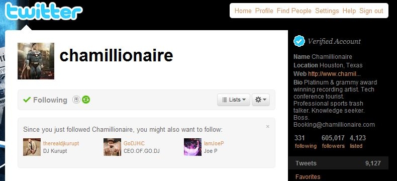
Like Facebook, Twitter Starts Using Algorithms To Bulk Up Social Graph
Last month, we noted that Twitter was testing a “You both follow” feature, showing users you and another user both follow. That’s interesting, but not particularly useful. Today, they’ve begun to roll out
a new “Suggestions for You” feature which looks at who you follow, and who the people you follow follow, and suggests new people for you to follow. Yes, just like Facebook does. This is very useful.
In fact, this is arguably the most useful social graph feature that Twitter has rolled out yet. A few weeks ago, Twitter rolled out a new name results area for search — which was incredibly helpful for finding celebrities or brands on Twitter. But this is better. This is all about finding people you may actually be interested in, but for whatever reason, haven’t connected with yet.
via techcrunch.com
At Logan Airport, tweeting is taking off – The Boston Globe
At Logan Airport, tweeting is taking off
(Wendy Maeda/Globe Staff)Tim Saccoia and Lisa Brown are two of the five people on the Massachusetts Port Authority’s social media team. They follow Logan Airport’s Twitter account from their East Boston offices.
Want to know where to get a burrito in Terminal C at Logan International Airport? Wondering if a storm has delayed your flight?
Follow @bostonlogan on Twitter, and chances are you’ll find the answer.
Logan has more followers on the microblogging site Twitter than any other major airport in the country — 4,000 and counting — and is second in the nation only to Richmond International Airport’s nearly 6,000 followers, according to the aviation consultancy AirGate Solutions. Worldwide, Logan ranks fourth, behind Heathrow and Manchester airports in England.
Logan’s five-person social media team tweets about anything from flight cancellations and airfare sales to information about book signings and Christmas carolers. The team also reaches out to the captive audience of people tweeting from the airport who are looking for the lost and found — or are just plain ecstatic about their parking spot.
Follower Mika Pyyhkala, who is blind, recently sent the Logan Twitter team a message about a Wi-Fi problem he was having with his voice-over software, and he heard back from them an hour later. Soon he had a temporary solution, followed by an inquiry from the airport’s Wi-Fi vendor.
Pyyhkala, who is president of the National Federation of the Blind of Massachusetts, was impressed. “You typically don’t have good results if you just call the 800 number for a company,’’ he said.
Lisa Brown, the social media manager at Logan who handles most of the tweeting duties, said people are often taken aback when they get a personal response: “A lot of people still see it as this big bureaucracy.’’
She sees the occasional “I hate Logan Airport’’ comments — which she usually responds to by saying, “Can you be more specific?’’ But the majority are surprisingly positive, she said.
The Boston airport’s numbers hardly rival those for Twitter’s most popular users. Actor Ashton Kutcher, for instance, has more than 5 million followers. Still, among airports, Logan has a healthy following, largely credited to the variety of content on its Twitter feed.
Logan has partnered with airlines to give away free trips — currently the airport and SATA have a promotion for a vacation to Lisbon, airfare and six nights’ hotel stay included. Logan even let its followers know when the movie “Hot Tub Time Machine’’ was available at the Redbox rental station in Terminal B.
This attention to detail goes a long way in the airport Twitter world. Officials at Richmond International, which tops the Twitter-follower list, send out quirky, personal messages, such as one asking a passenger if he had a 17-pocket jacket to avoid baggage fees.
Social media are all about building community and relationships, and small airports like Richmond’s — which has 23 million fewer annual passengers than Logan but 2,000 more Twitter followers — with fewer layers of bureaucracy, tend to do a better job at this, said Robert Cook, managing director of AirGate Solutions. Small airports in Akron, Ohio, and Harrisburg, Pa., for instance, have far more followers than major airports in New York and Chicago; Miami International Airport doesn’t even have a Twitter account.
But the competition isn’t that fierce. Orlando International Airport, which has the fifth-highest number in the country, hasn’t posted a new tweet since November. Baltimore Washington International Airport’s tweets tend toward the practical. One recurring post: “Current Conditions at BWI Marshall are normal with no significant delays.’’
Most passengers don’t have a choice which airport they fly out of, so why do airports bother tweeting at all?
It’s all about money, of course. Airports benefit from attracting followers and telling them where to shop because airports get a cut of the retail business, said Cook of AirGate Solutions. “As retail goes up, their percentage will creep up,’’ he said.
But most passengers just see the feel-good side of it.
When Justin Levy tweets about packing to leave his Braintree home for one of his several weekly trips through Logan, he often gets a “Have a nice flight’’ message. He even got a “Congratulations’’ announcement over the loudspeaker at the JetBlue gate when he and his wife were leaving for their honeymoon.
“It humanizes brands, and it humanizes places,’’ said Levy, who is in the social media business at New Marketing Labs in Canton. “Who ever thought you could have an enjoyable experience with an airport?’’
via boston.com
What Your Company’s Twitter Account Says About You
Image: wikimedia
Note: This post was originally published on OPEN Forum.
Companies large and small have started using Twitter as a way to promote themselves, interact with customers, and handle customer service.
Some do it better than others.
Of course, how you should run your company’s Twitter account varies widely by the size and type of your company — a small coffee shop will obviously want a different Twitter presence than a large airline or utility company, or a news website.
But there are certain universal truths to what your company’s style of tweeting reveals about your corporate culture, your attitude towards social media, and what you think about your customers in general.
Want to know what people think about YOUR company’s Twitter account?
Take a look at it and compare:
– Your Twitter: An automated list of headlines and links to your site, blog, etc.
What it says: We don’t care about interacting with our customers, at least not on Twitter. We just want you to visit our website, where we might also not want to interact with you.
– Your Twitter: Mostly retweets of nice things that other people are saying about you.
What it says: We don’t have anything interesting to say, and we don’t care about you, or we wouldn’t be spamming you.
– Your Twitter: Mostly apologies for terrible service, and cues to call/email your customer service department.
What it says: We should probably fix our business first instead of hanging out on Twitter.
– Your Twitter: An engaging feed clearly written by humans, including a good mix of news, tips, deals, contests, photos/video and basic customer support.
What it says: We’re here in earnest and we care. And in exchange for giving us some of your attention, we’re going to reward you, or try to make you feel special.
Get a sense that #4 is the best? You’re paying attention! Some of the best we’ve seen include Virgin America.
They obviously won’t necessarily be the perfect model for your specific business, but they’re at least in the right spirit.

CRAZY: Apple Ships More Mobile Phones Than Motorola For The 2nd 1/4 In A Row
Here’s what the trend looks like in overall device shipments over the last three years:
Here’s the trend zoomed in over the past year:


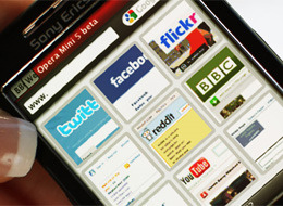
Opera Mini Serves One Billion Daily Page Views
via mashable.com
Despite the fact that popular smartphones such as the iPhone and Android already have great web browsers, Opera’s Java ME-based mobile browser Opera Mini is constantly growing. According to Opera, on July 25th it served one billion page views.
The mobile browser, which recently dropped the beta tag from the already quite polished version 5.0, has been growing steadily over the past couple of years. In June 2008, it was serving 100 million page views every day; in June 2010, this number was 910 million.
Opera Mini’s distinguishing feature is its compression technology, which compresses web page content up to 90% on Opera’s servers before sending them to the actual device, which saves time and bandwidth.
To try out Opera Mini, point your mobile browser m.opera.com